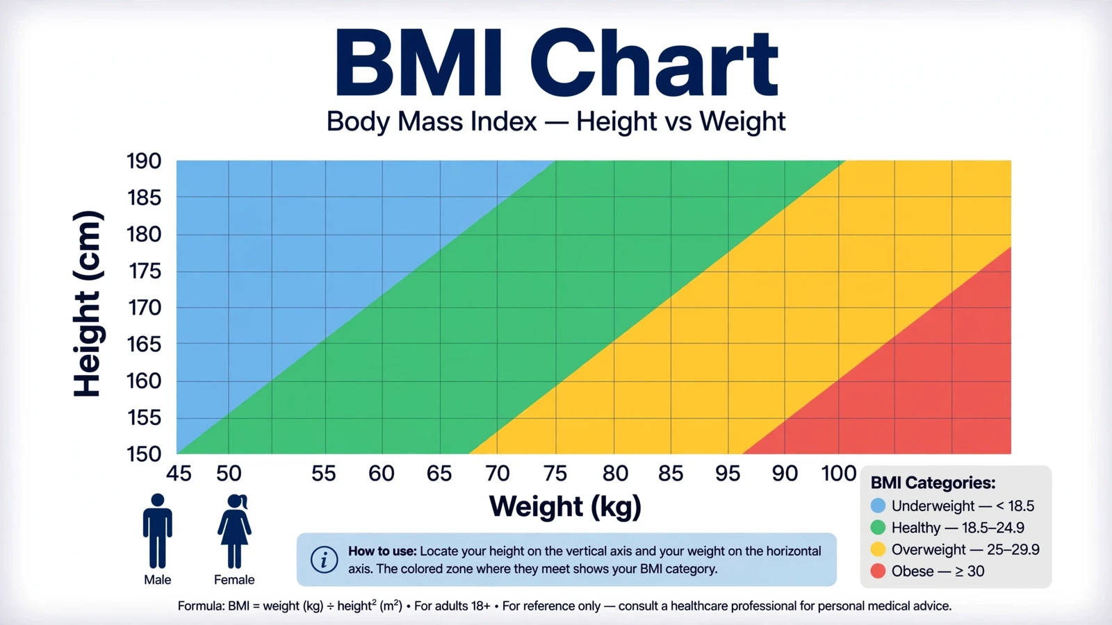
A BMI chart shows you exactly where your weight falls for your height, using the standard categories: underweight (below 18.5), healthy (18.5-24.9), overweight (25-29.9), and obese (30+). The chart is the same for men and women, and this guide walks you through how to read it, what the numbers mean, and where the chart falls short.
What Is a BMI Chart?
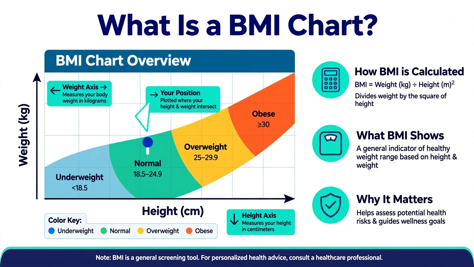
A BMI chart is a visual grid that maps height against weight and color codes the resulting BMI categories. You find your height on one axis, your weight on the other, and where they meet tells you your category at a glance.
The concept dates back to the 1830s, when Belgian statistician Adolphe Quetelet developed the Quetelet Index (weight divided by height squared). It was renamed Body Mass Index in 1972 by researcher Ancel Keys, who found it was the best simple proxy for body fat in population studies. The World Health Organization later standardized the cutoff points we still use today.
A typical BMI chart looks like this in table form:
| BMI | Category | Health Risk Level |
|---|---|---|
| Below 18.5 | Underweight | Increased risk of nutrient deficiency |
| 18.5 – 24.9 | Healthy weight | Lowest risk |
| 25 – 29.9 | Overweight | Increased risk |
| 30 – 34.9 | Obese (Class I) | High risk |
| 35 – 39.9 | Obese (Class II) | Very high risk |
| 40+ | Obese (Class III) | Extremely high risk |
Charts are handy, but they’re static. For your exact number, a BMI calculator does the math instantly and tells you precisely where you stand.
Is the BMI Chart Different for Men and Women?
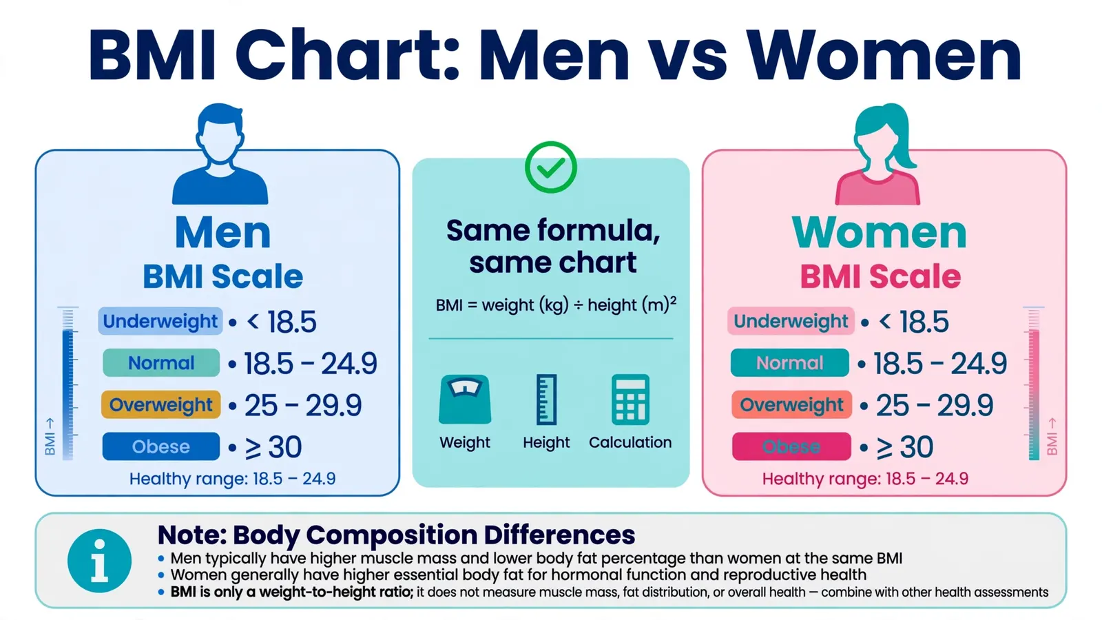
No. Men and women use the exact same BMI chart and the same cutoff points. A BMI of 27 means “overweight” whether you’re male or female.
This confuses people because men and women do differ in body composition. On average, women carry a higher percentage of body fat at the same BMI than men do, thanks to differences in muscle mass, bone density, and fat distribution patterns driven by hormones. So why one chart?
The answer is practicality. The BMI cutoffs were calibrated against population level health outcomes, and the risk curves look similar enough for both sexes that separate charts weren’t justified. The simplicity of one universal chart outweighs the precision a sex specific chart might add.
That said, interpretation can differ slightly. A muscular man with a BMI of 27 is more likely to be “mislabeled” as overweight than a woman with the same BMI, simply because men tend to carry more muscle. And for women, waist circumference can be an especially informative companion metric because abdominal fat patterns shift notably around menopause.
How Do I Read a BMI Chart?
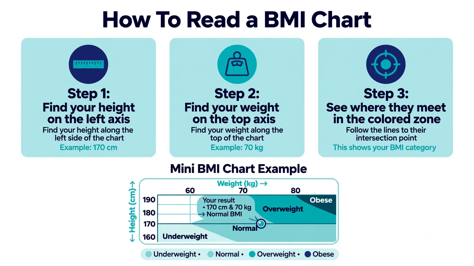
Reading a BMI chart takes about ten seconds once you know the layout.
- Find your height along the left side or top of the chart (whichever axis lists height).
- Slide across to your weight on the other axis.
- Note the color or number where your row and column intersect. That’s your BMI category.
For example, if you’re 5’6″ and 150 pounds, you’ll land in the green “healthy” zone with a BMI around 24.2. At the same height but 180 pounds, you’d be in the yellow “overweight” zone with a BMI near 29.
Most online charts also print the actual BMI number in each cell, not just the color. If yours only shows colors, use a calculator to get your precise figure. The difference between a BMI of 24.8 and 25.1 is the difference between “healthy” and “overweight” on paper, even though it’s essentially the same body.
One tip: always double check whether the chart uses metric or imperial units before you start. Mixing them up is the most common reading mistake.
What Are the BMI Categories in Detail?
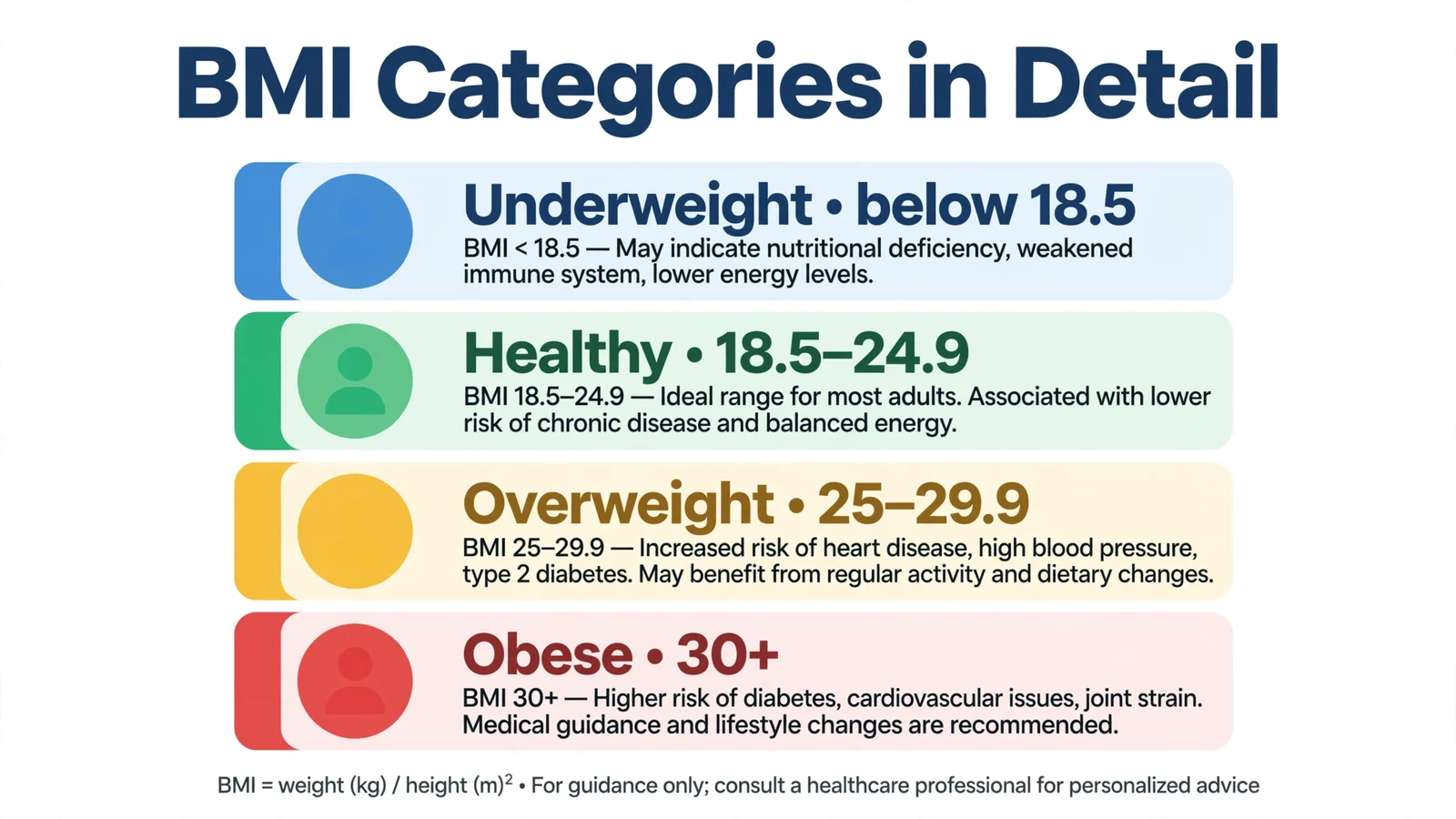
Each category on the chart corresponds to a range of health risks observed in large studies. Here’s what they actually mean.
Underweight (below 18.5). Associated with weakened immunity, fertility issues, bone density loss, and nutrient deficiencies. If your BMI is here without trying, see a doctor to rule out underlying causes.
Healthy weight (18.5-24.9). The range linked to the lowest risk of weight related disease in population studies. It’s a wide band on purpose: healthy bodies vary.
Overweight (25-29.9). Risk for hypertension, type 2 diabetes, and cardiovascular disease starts climbing. But context matters enormously. A BMI of 26 in an active person with normal blood work is very different from 26 with high blood pressure and blood sugar.
Obese Class I (30-34.9), Class II (35-39.9), Class III (40+). Risk rises steeply with each class. Class III obesity, sometimes called severe or morbid obesity, is associated with substantially higher rates of heart disease, diabetes, sleep apnea, and joint problems. Medical guidance is strongly recommended at these levels.
Remember: categories describe populations, not individuals. Your doctor interprets your number alongside everything else they know about you.
Where Does the BMI Chart Fall Short?
The BMI chart is a blunt instrument, and knowing its blind spots makes you a smarter user of it.
It can’t distinguish muscle from fat. Athletes, weightlifters, and anyone with above average muscle mass routinely chart as “overweight” while being very lean. This is the chart’s most famous flaw.
It ignores fat distribution. Two people with a BMI of 28 can have very different health profiles if one carries weight around the belly and the other around the hips and thighs. Abdominal fat is metabolically more dangerous.
It wasn’t built for everyone. The original research populations were predominantly European. Studies suggest the standard cutoffs may underestimate risk in South Asian, Chinese, and other Asian populations, where metabolic problems can appear at lower BMIs. The WHO has floated lower thresholds for Asian adults, though they aren’t universally adopted.
It also doesn’t account for age related changes in body composition. An older adult and a younger adult with the same BMI often have quite different muscle to fat ratios.
None of this makes the chart useless. It makes it a first screen, not a final answer. Pair it with waist measurement and basic blood work and you’ve got a solid, honest picture.
Frequently Asked Questions
What BMI should a 5’5″ woman aim for?
A 5’5″ woman is in the healthy range between about 111 and 150 pounds (50 to 68 kg), which corresponds to BMI 18.5 to 24.9. Most women feel their best somewhere in the middle of that band, but the right spot varies with build, muscle mass, and personal health history.
Is the BMI chart accurate for muscular men?
Often not. Muscle is denser than fat, so muscular men frequently chart as overweight or even obese despite having low body fat. If you lift weights regularly, body fat percentage or waist measurement will tell you more than the chart alone.
What is the BMI chart for a 60 year old?
The same chart used for all adults. There are no separate official BMI charts by age for adults, though some geriatric researchers argue that slightly higher BMIs may be acceptable past 65. Unless your doctor advises otherwise, use the standard 18.5-24.9 healthy range.
Where can I find a printable BMI chart?
The CDC publishes a straightforward adult BMI chart you can print, and many health sites offer PDF versions. But honestly, an online BMI calculator is faster and gives you an exact number instead of making you eyeball a grid.
Why do men and women share the same BMI chart?
Because the relationship between BMI and health risk looks similar enough across sexes at the population level. The cutoffs were set from large studies of disease risk, not from body composition ideals, so one chart serves both. Individual interpretation still accounts for sex differences in muscle and fat patterns.
Can children use the adult BMI chart?
No. Children and teens need age and sex specific BMI percentiles, not the adult cutoffs. A pediatrician or the CDC’s child BMI calculator will place a child’s BMI on the right growth chart for their age.
Conclusion
The BMI chart is the same for men and women, and it hasn’t changed in decades: under 18.5 is underweight, 18.5 to 24.9 is healthy, 25 to 29.9 is overweight, and 30-plus is obese. Learning to read it takes a minute, and it gives you a quick, honest snapshot of where your weight sits relative to population health data.
But a chart is a starting point. If your number surprises you, get your exact figure from our free BMI calculator, check your waist measurement, and talk through the full picture with your doctor. And if weight loss is your goal, our calorie calculator can map out a daily target that actually fits your life.
The CDC’s BMI information page has the official charts and category definitions if you want to dig deeper, and the World Health Organization’s BMI data portal shows how these cutoffs were developed.